COMMONS
It is almost impossible to overstate the relevance of public spaces to modern societies. The origin of democracy itself is tied to the idea of a common space in which everyone has equal importance, and where everyone can speak and be heard. In the US, the deterioration of public spaces with suburbanization arguably coincides with the deterioration of public life. Now, when a new generation of Americans is again attracted to the city, one of our roles as architects should be to rethink public spaces as the most direct embodiment of the commons in the built environment. These projects propose architectures conceived around outdoor common spaces, whose programs, forms and materialities carry at least as much meaning as the buildings themselves.
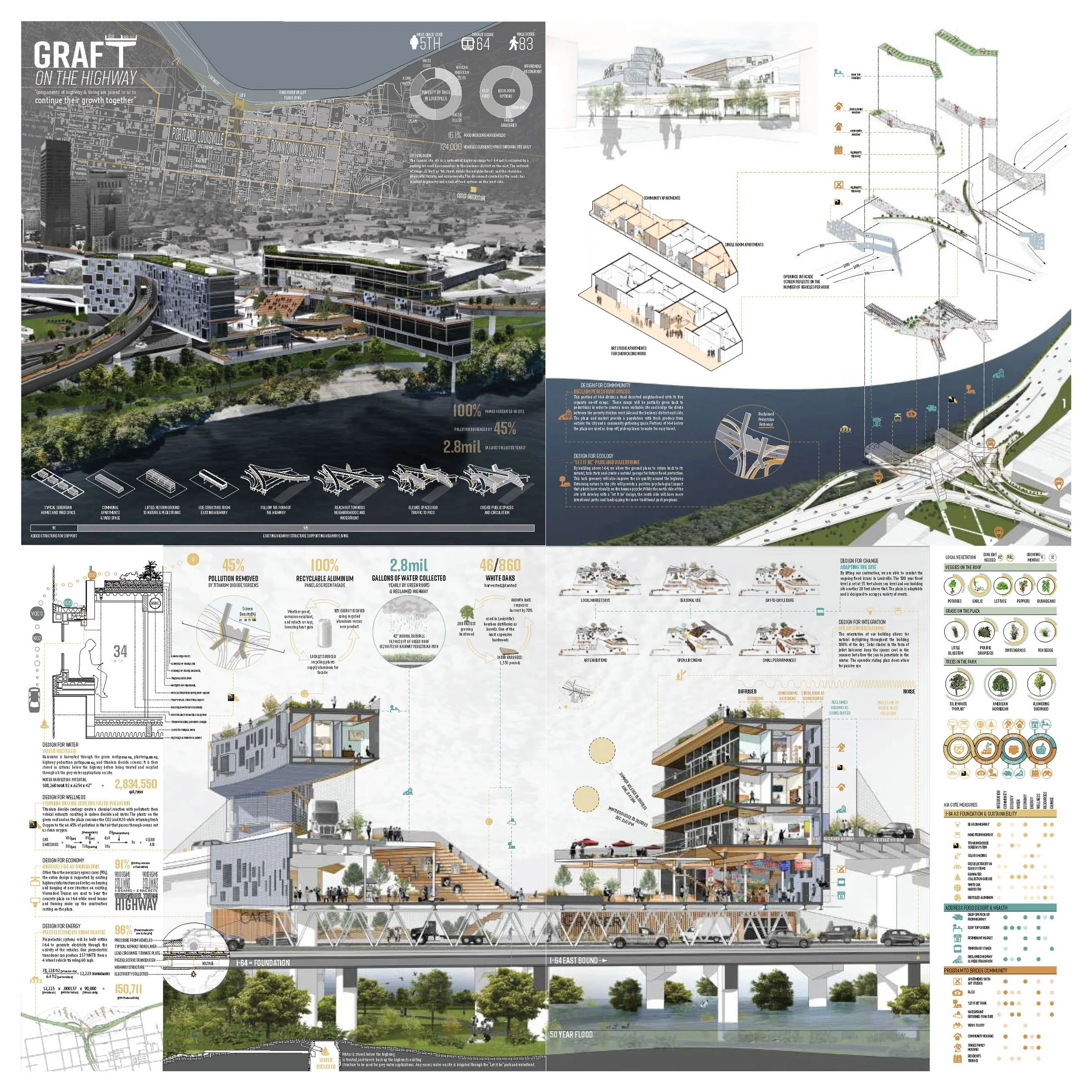
GRAFT
DAN KELLY | STEFAN LANGEBEEKE
NURTURE WITH NATURE
2019 | LOST SPACES | Architectural solutions for leftover space created by America’s elevated urban highways
David Franco | Ulrike Heine | George Schafer
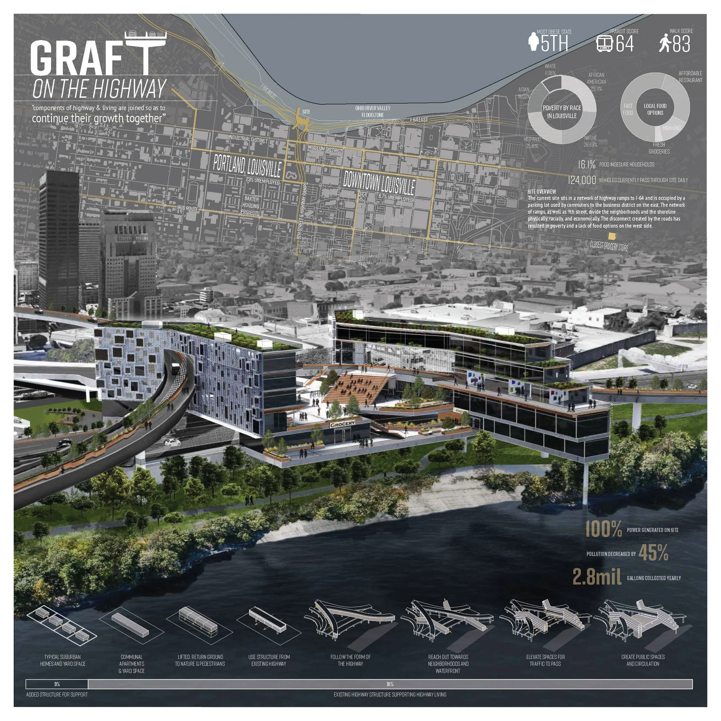
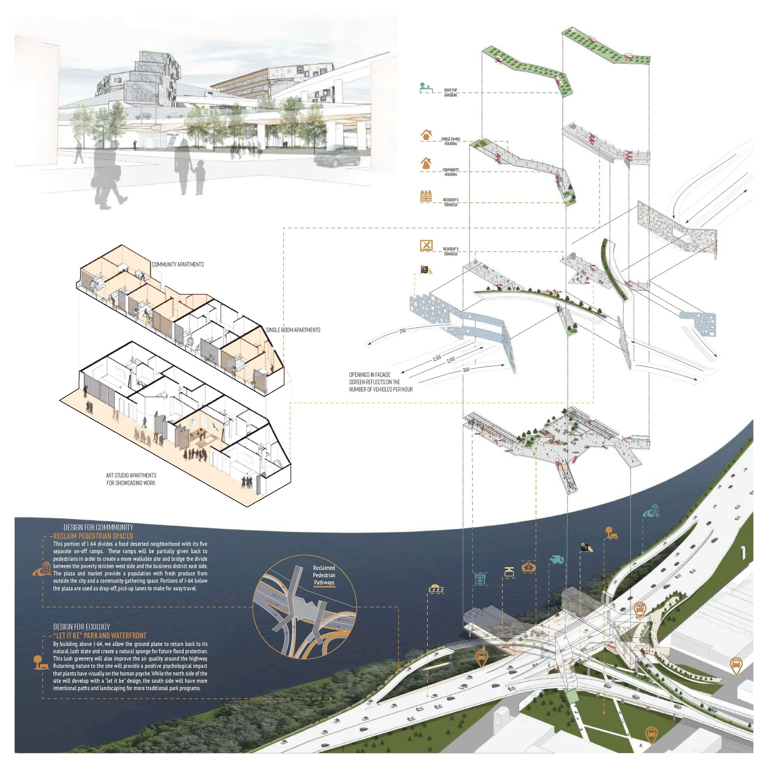
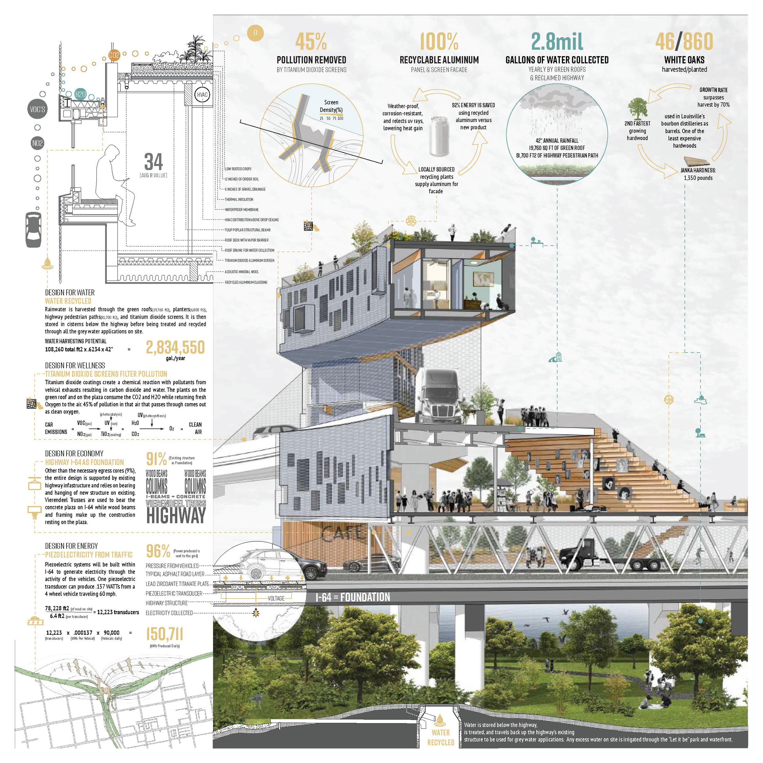
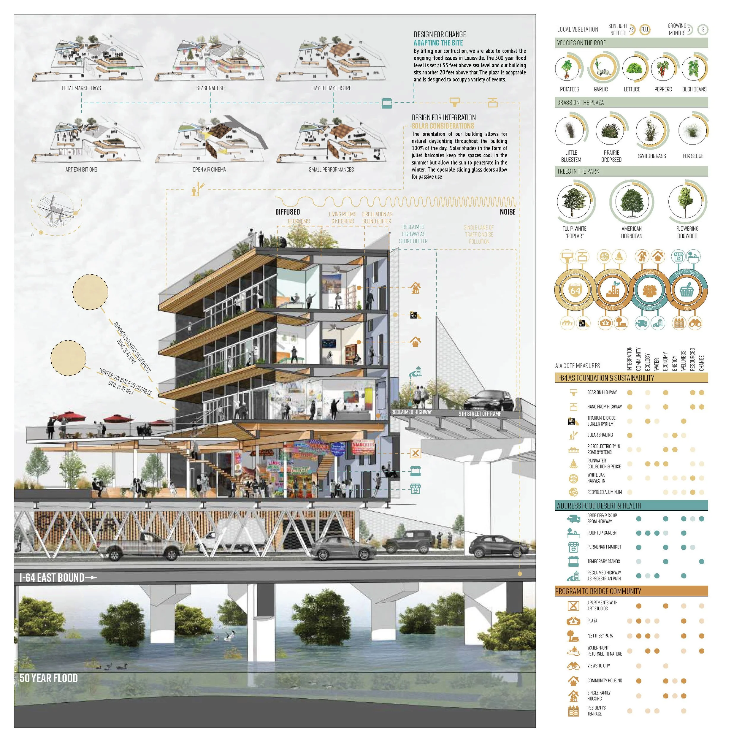
Located in Louisville, Kentucky, our proposal is located between the 9th street on and off ramps of Interstate-64. Historically, 9th street divides down-town Louisville from West Louisville, which houses the more industrial, sub-urban side of the city. This physical division of the city has also caused a demographic division amongst its citizens; with the predominantly affluent downtown Louisville separated from West Louisville, comprised of a lower income demographic, including 14% of the citizens of Louisville living in poverty. Our site is also located on a very active flood zone along the Ohio River. This has had great implications for the city of Louisville in terms of damage costs, flood prevention costs, and rebuilding efforts. Our proposal seeks to introduce an architectural solution to this flooding issue by elevating the construction above the existing flood wall (55 feet above sea level) and to pre-vent damages caused by future floods. Our elevated proposal also aims to reconnect a divided Louisville through a community plaza above the existing I-64 highway. The proposed 74,500 square foot plaza is nestled between two buildings totaling 87,700 of mixed-use program. 56,000 square feet of mixed demographic residential units (single family units, “community units” consisting of 4 rooms each with a shared common space and bathroom, and one-bedroom “studio” apartments that feature a commercial studio space) and a 31,700 square foot marketplace that houses a grocery store with fresh produce, food stands, local craftsmen merchandise, and art galleries. The marketplace has operable
doors and walls that line the plaza, allowing it to open completely to the outside for events and an outdoor market experience. Weather permitting, these operable walls will allow the entire plaza level to be utilized for community gatherings, art galleries, food markets, and local events or traditions. The orientation of the two buildings and the open area of the plaza allow for plenty of light to flood into the space as those buildings lie on the east and west side of the plaza; the sun path allows for light to flood the space at all points of the day, with the most light pouring in around noon from the south (the sun angle being at 75 degrees at 1:30 on June 21st, and 33 degrees at 1:30 on December 21st). Our elevated plaza allows the natural vegetation below the elevated highways, including new hydrophilic plants that will absorb water, to reclaim the ground plane below and become natural protection from future floods. With the location of our site being right on 9th street (the physical divider between downtown Louisville and West Louisville), our proposal will re-claim portions of the highway’s off and on ramps, increasing the walkability on either side on the highway that leads to a centralized plaza with market spaces on either side. With higher pedestrian activity in this area, that divide will begin to dissipate and a higher concentration of foot traffic crossing 9th street, particularly through our proposal and reclaimed highway ramps, can be expected.
REVIVE
GABRIELLE BERNIER | GARRETT SCHAPPELL
SEEKING ASYLUM
2019 | LOST SPACES | Architectural solutions for leftover space created by America’s elevated urban highways
David Franco | Ulrike Heine | George Schafer
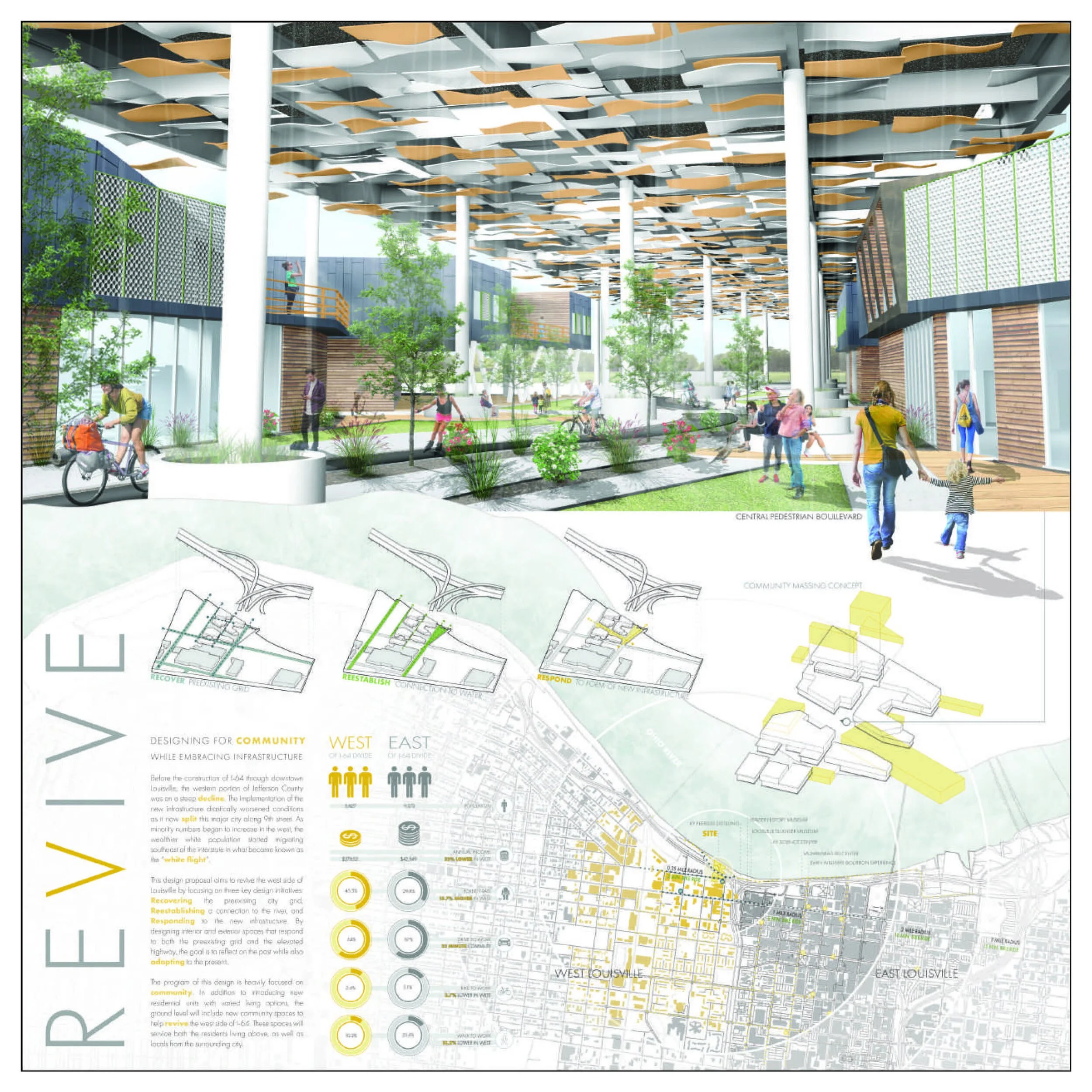
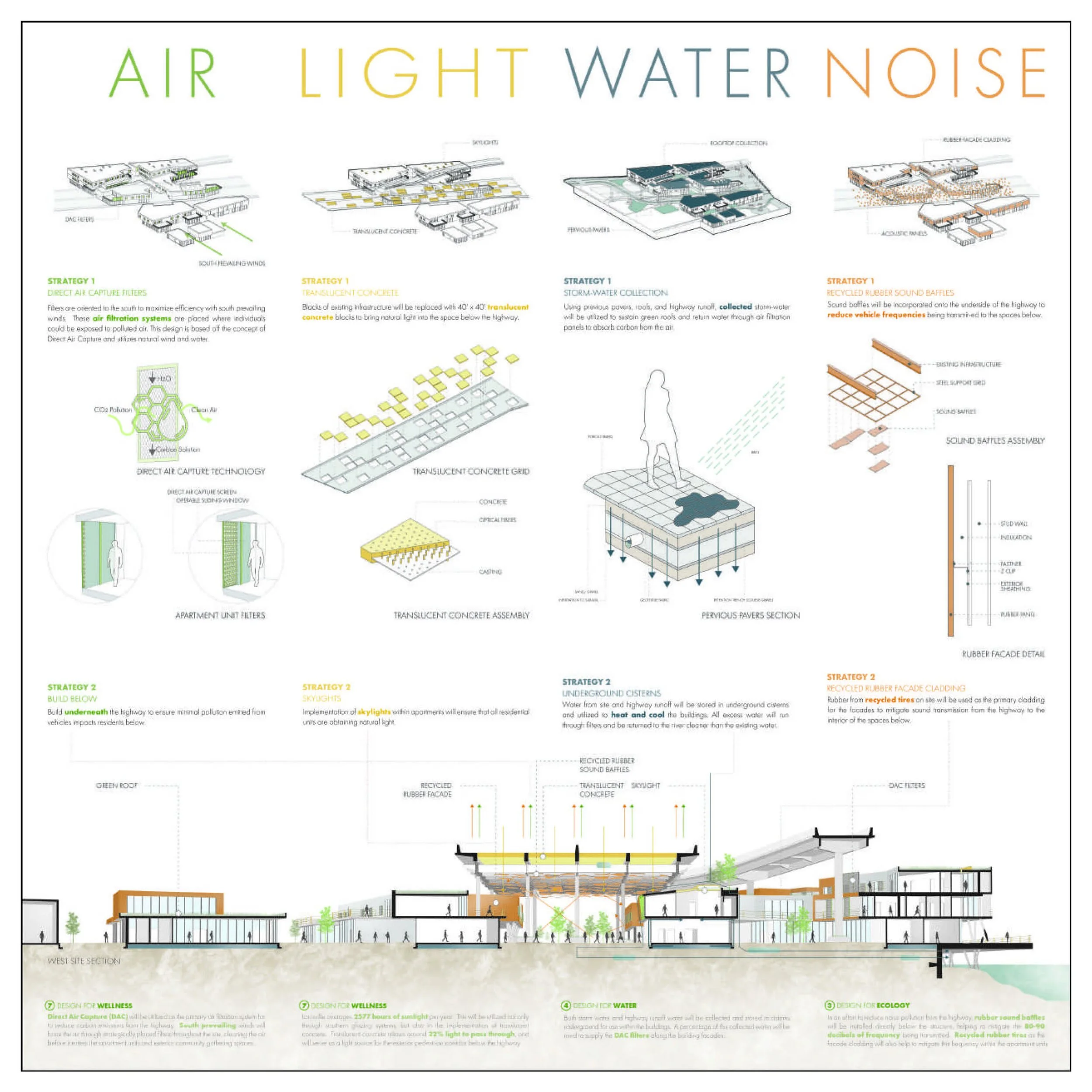
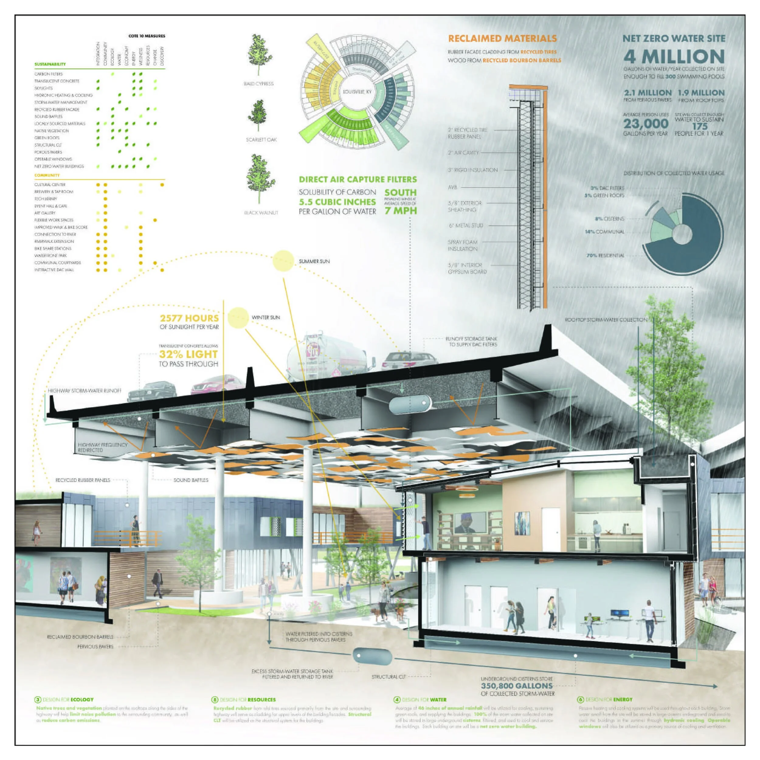
Buildings on this site will primarily serve the residents of Louisville, as well as provide housing opportunities to those wishing to live slightly outside the city, while also maintaining easy access to the downtown area. The program of this design is heavily focused on community. In addition to introducing new residential units with varied living options, the ground level will include new community spaces to help revive the west side of I-64. The city of Louisville, KY has a relatively moderate climate. Winter’s average about 47 degrees and summers average about 86 degrees. Because of the site’s location set within a densely populated city, cooling to mitigate the heat island effect in the summer is an important consideration, as well as designing for heat and light below the elevated highway in the winter months. The total square footage of the site is 213,370 sf (about 5 acres), 20 percent of which will be occupied by new buildings (46,900 sf). There is a significant amount of exterior space incorporated throughout the site to encourage maximum outdoor activity, as well as community building. Massing of the buildings respond to the layout
of the city’s preexisting grid that was destroyed upon the construction of the elevated highway. This lay-out aims to recover the grid and create a more inviting space for pedestrians through this city extension. The central exterior “spine” through the site responds to the form of the elevated highway above. Voids were then extracted out for exterior communal gathering spaces for pedestrians traveling through the site. These voids that are created within the building masses provide spaces for pedestrian refuge and community building, as individuals progress through the site between the city and riverfront. This focus on the strategic design of the “in-between” space places more of an emphasis on the journey and less on the destination. These spaces encourage pedestrians to pause for a moment while in route to their destination, without having to go out of their way – promoting time spent outdoors and with other members of the community.
Beginning in 2012, a rising number of migrants journeyed to western Europe, seeking asylum from economic hardship and war-torn countries in what the world now refers to as the “refugee crisis”. During their travels, refugee’s cell phones become their lifelines, affording them access to locations of refugee camps, various government services, and contact with family members. Yet, this same accessibility to resources is not so easily found upon arrival into Madrid. Immigrants become alienated from Spanish society due to a lack of language training programs, employment opportunities, and government aid, making it difficult for them to truly integrate within their new culture. To bridge this gap, Superficie-al seeks to use the already familiar lifeline of the cell phone to bring in both refugees and residents of Madrid and create meaningful physical connections through integrative programs and open spaces. It’s name (a play on the Spanish word for surface and the English, superficial) goes beyond surface level by challenging media’s perception of refugees as a superficial condition and highlighting technology’s importance in understanding their needs. One of the key aspects of this proposal is the building’s ability to respond to users on a personal level – through their cellphone. An application specific to the building provides a gateway to its programs, allowing users to filter and choose the services they require. As technologies shift and building methods advance, the digital feedback loop created in Superficie-al will respond and adapt to conditions based on user demand. This connectivity, as well as energy and water movement, is manifested in “energy columns” found
throughout the central open-air portion of the structure. These columns perform multiple functions, including funneling down the energy collected by solar panels above to capacitors that provide wireless charging on each level. They also capture and circulate water through the building and down to cisterns in the existing unused parking garage below, which doubles as a space to pre-condition forced air. The columns also provide support for the large roof above, which shades the space from Madrid’s hot, dry weather, and plays host to BIPV panels, rock gardens and walkable surfaces. The building’s form follows the perception of the refugee by creating a subtle landscape with a strong emphasis on sightlines. Users can meander along the sloping paths and find themselves in an open courtyard looking up at the faceted surface overhead, or, they can wind up fifty feet above looking out over busy Spanish streets. By adopting the properties of a traditional plaza, the paths created take into account the various velocities at which people move across the space, making plenty of room for possible social interactions. Similarly to how refugees rely on technology during their travels, the infra-structure of Superficie-al supports interaction and access to a new physical network through a technological platform. This proposal is about connecting and integrating newcomers and city residents through positive interactions that not only add to the existing digital, physical, and infrastructural net-works, but also support a sustainable life cycle for the building.
CONNECTIVITY HUB
KSENIA KRASNOVA | YIBO ZENG
PRIDE HQ
2017 | REFUGEES WELCOME | Reinventing the Architectural Possibilities of a Refugee Center in the Heart of Madrid
Ufuk Ersoy | David Franco | Ulrike Heine
A place for the community, for integration, a place for communication, a place for rest, a place for learning, a place for entertainment, a meeting place, a place for help, a place for a feast - this is a market square. The market square in the center of Madrid (Plaza Mostenses) now looks more like parking with lifeless facades, which a large stream of local residents uses only for transit. Realization of a large social, ecological and economic potential of the area is a priority of the project. Focusing on the city project, which should transform the square and give the city an effectively functioning space for many years to come, the services necessary for local residents were put in the forefront. But refugee issue perplex the people around the world. The project aims to response the situation happened in the Madrid city in this field due to last wave of refugees. The square was chosen due to its central location and ineffective contemporary usage of its potential. It is currently occupied by the old malfunctioning market building, lot of parking spots and roads. The project keeps the market feature, as necessary traditional attribute of the square
and combines it with the public kitchen to serve and connect the residents with the refugees. The building program is designed based on the local climate and peoples’ daily life needs. One of the main parameters for design was the urban context. Form of the building is following functions, people circulation and square space formation to create natural integration in terms of scale and functioning. The double skin or second facade, which covers all the building and part on outdoor public spaces, is made of recycled plastic provides the in-between space with reduced sunlight, higher humidity where people can relax and communicate. All climate specialties are considered and used as an advantage. For example, the solar panels on the roof provide the electric power for the building. 200000 plastic bottles make the building skin, it saves the material and reduces the pollution. Activation of ground floor level life creates vibrant pedestrian city square, which is gonna accumulate city life and economical efficiency.
CASCADE
CHELSEA ANDERSON | YAGE CHEN
BELOVED COMMUNITY
2016 | TECHNIFIED ECOSYSTEMS | The city as an artificial landscape
Ufuk Ersoy | David Franco | Ulrike Heine | Henrique Houayek
Cascade is an inversion of the typical corporate monumental tower; by turning on its side it intermixes users and public in a generous public space. This gesture promotes cyclical economics through a Learning Center for a car manufacturer; where people can train to work, learn about the company’s sustainable practices. The Learning Center includes many public amenities as well as a technology incubator for start-up companies. Cascade is a model for increasing the economic, social and environmental health of Main Street towns, by bringing back work life. Situated in the downtown, the 4-acre site sits as a barrier between Main Street and the
city park. The large roof-landscape brings continuity by mixing the urban and natural conditions and works as a bioclimatic system by cooling and purifying the air for inhabitants and passers by. The existing building has been a beacon on Main Street since 1937 and was kept for its social and architectural prominence. The Learning Center totals 150,000 square feet of program with 50,000 square feet of office, classrooms, and remote work areas. The program incorporates 100,000 square feet of shared public use with a library, food court, bookstore, exhibition space, bank and restaurant.
